Visualization types and properties
This section describes the various types of visualizations that may be used in dashboards and properties you use to configure each type.
Properties common to multiple visualization types
Note
If the visualization configuration dialog's properties display no fields, that means something is wrong with its query, or the application has not been deployed.
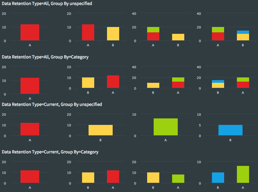
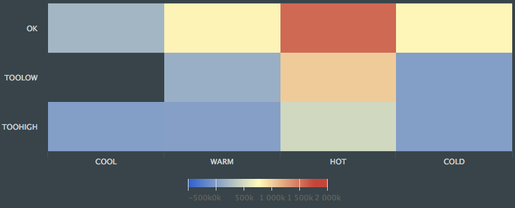
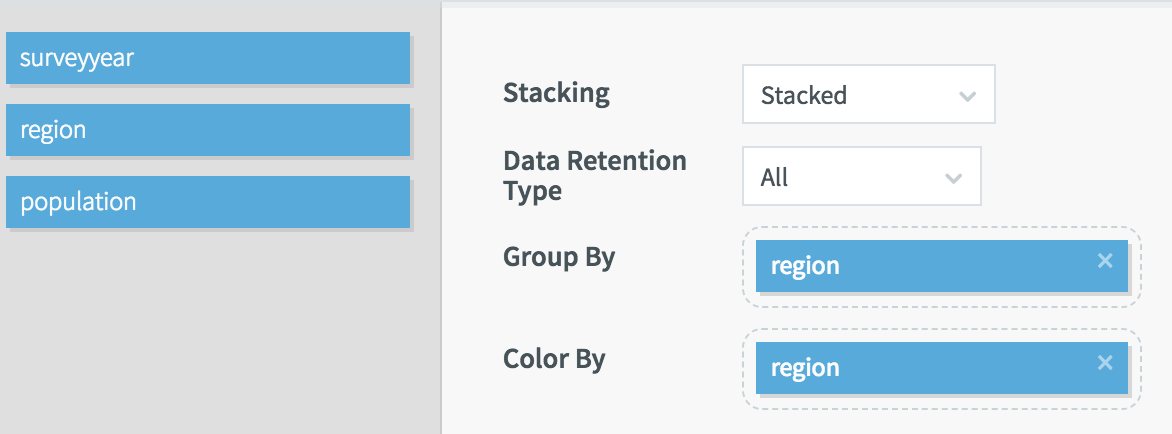
Data Retention Type: Select All to include all data from the query, or Current to include only the most recent. "All" is not supported for pie / donut charts as they would quickly become unreadable.
Group By: If specified, each value for this field will be visualized as a single point, bar, or slice. This setting interacts with Data Retention Type as follows:
Data Retention Type | Group By | behavior |
|---|---|---|
All | unspecified | one new chart element for each value (for example, ever more bars are added to a chart) |
All | specified |
|
Current | unspecified | only one chart element, which is updated for each new value (this setting would make sense for a gauge, which displays only a single value) |
Current | specified |
|
The following shows the effect of the various combinations of Data Retention Type and Group By on a bar chart as each of four values (represented by red, yellow, green, and blue) is added.
Color By: If specified, values from this field will populate the legend and (unless overridden by conditional colors) the color of chart elements.
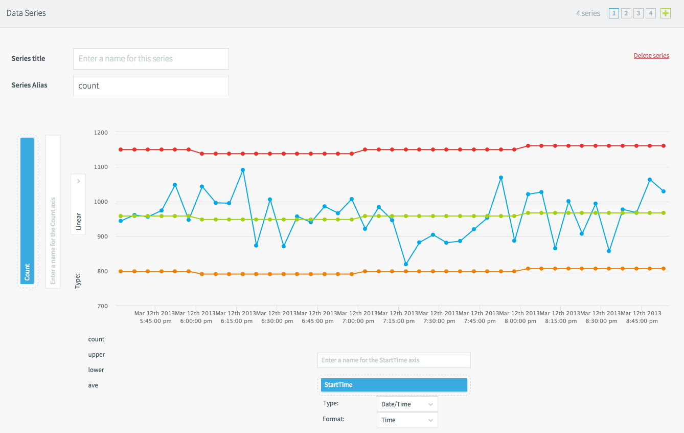
Data Series + / Delete series : For scatter plots and bar, line, pie and donut charts, adds or removes a data series.
Series Alias: When you have defined multiple series, use this to define custom colors. These strings are also used for the legend labels, if any. See the line chart on the PosApp "Company details" page for an example.
Note
If you define multiple series, leave Group By unspecified.
Type (for X and Y axes): select Linear or Logarithmic for numerical values, DateTime for time values, or Category for text values (for example, CompanyName)
Filter settings - Visible: If enabled, when the visualization's data is being filtered, a pop-up will appear showing the filter criteria. See Creating links between pages.
Time Field: A field of type DateTime to use when filtering by time. If not specified, filters will use WAction start time.
Polling: See Defining dashboard queries.
Drill Down and Page Filters: See Creating links between pages and Making visualizations interactive.
Tooltip Configuration: Use this to defines which values will appear when you hover the mouse pointer over a map or chart point, slice, or bar. Check Show All to display all values selected by the query or click Add Another as many times as necessary to select individual fields.
Add a conditional color: Allows you to manually select colors based on JavaScript expressions, such as field_name=="value". For example:
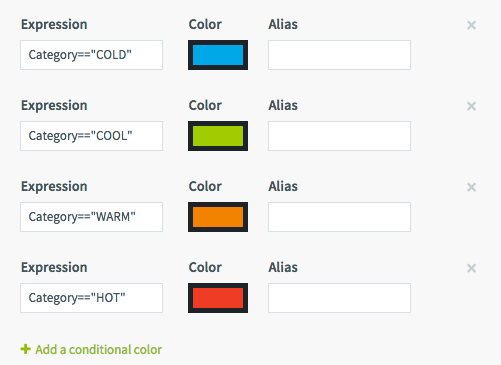
The seriesAlias variable may be used to manually assign colors to series based on their Series Alias settings. For example, from the line chart on the Company details page in the PosApp sample application's dashboard:
 |
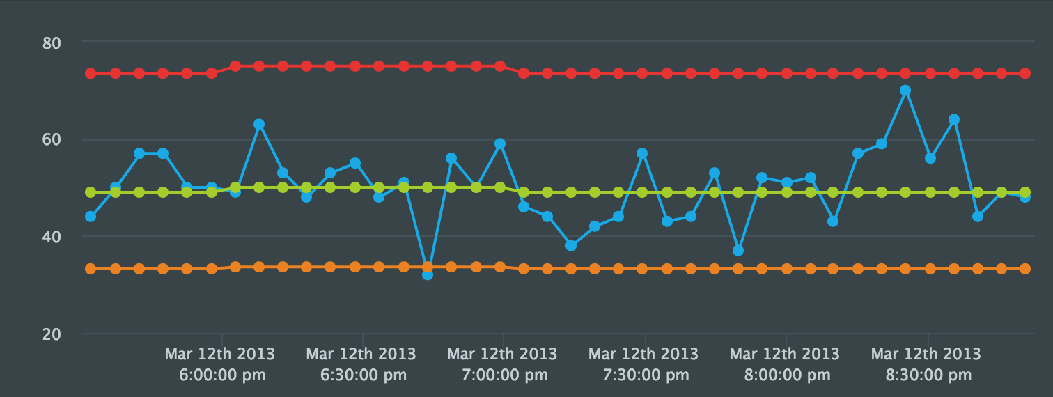
The above settings produce this result:
 |
Show Legend: Check to display a legend of the Color By values in the visualization.
Maximum number of values to show / Maximum number of series to show: A series is an element in a visualization that may include one or more values. For example, in the line chart above, there are four series (the four lines) and 40 values (the number of points per line). If you specify a Group By field, the number of distinct values in that field is the number of series.
The maximum number of values is per series, so, for example, if for the chart above it was set to 20, each of the four lines would have 20 points. The oldest value and the series that was updated least recently will be removed from the visualization as necessary to keep within the maximums.
Be sure you set these maximums high enough to display all the desired values. For example, in the map on the main page of PosAppDash, Maximum number of series to show needs to be at least 423 (the number of merchants), but Maximum number of values to show can be 1, since only one point is shown for each merchant.
Regardless of this setting, each visualization can display a maximum of about 2000 values.
Bar chart
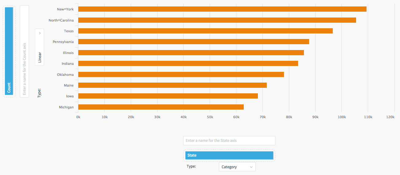
Set the Y (vertical) axis to the field containing the values that will control the height or length of the bars.
Set the X (horizontal) axis to the field containing the labels for the bars and set the axis type to Category.
For example, here are the settings for the horizontal bar chart on PosApp's main dashboard page:
 |
Here are the settings for the same chart but with vertical bars:
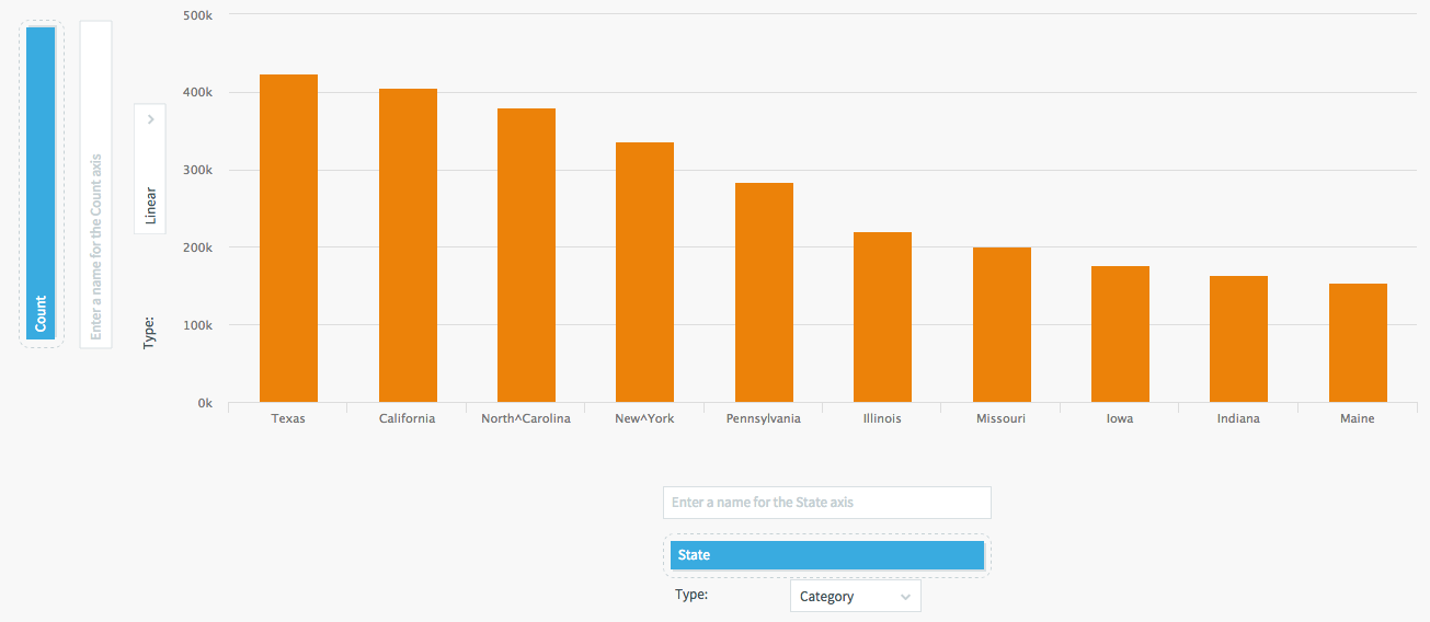 |
See Properties common to multiple visualization types for information on the other settings and an example of how to create a stacked bar chart using Group By.
Choropleth map
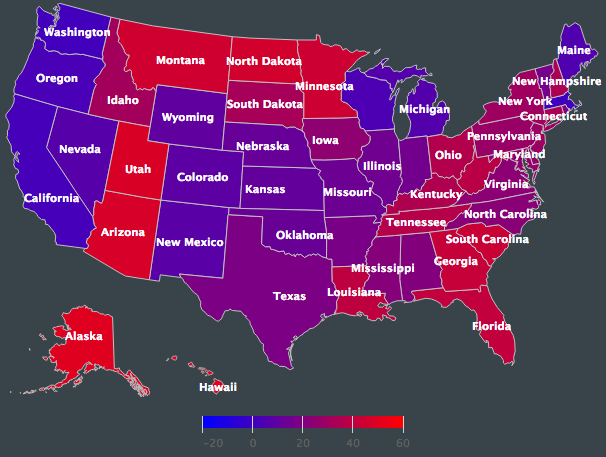
This is a beta preview feature. To run a sample application, copy the Choropleth directory from .../Striim/docs to .../Striim/samples, run Samples/ChoroplethDemo.tql, and view the ChoroplethDemoDash dashboard. See www.highcharts.com/docs/maps/getting-started for more information.
Column range chart
This is a variation on a Bar chart. The Value Type, Low Value Field, and High Value Field properties control the start and end points for the bars and the labels for axis on which the values are plotted. The low and high value fields must match the Value Type setting.
Gauge
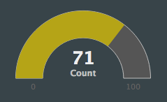
A gauge is similar to a bar chart with a single bar. It visualizes a single numeric value on a 180-degree gauge. The query for a gauge will typically use an aggregate function such as MIN, MAX, or LAST to select a single value from the input field. See the See the PosApp "Company details" page for an example.
Units is a text label for the gauge. Set the Minimum to zero or whatever other number is appropriate and Maximum at least as high as the maximum expected value. These values appear as labels below the left and right ends of the gauge.
By default, the color changes gradually from green near the minimum to yellow in the middle and red at the maximum. You may set colors manually by defining Thresholds, but they will still change gradually. For example, the gauge above has a threshold of 60 for green and 100 for red, so with a value of 71 the gauge is yellowish-brown.
Minimum, Threshold, and Maximum values may be defined using field names, optionally including formulas such as HistoricalAverage * 0.25 or HistoricalAverage * 2.
Heat map
In a heat map, the X and Y axis fields define a grid, with the squares of the grid colored based on the values of the Z axis. If the Label Cells option is checked, the Z values will appear in the cells.
See Properties common to multiple visualization types for information on the other settings.
Icon
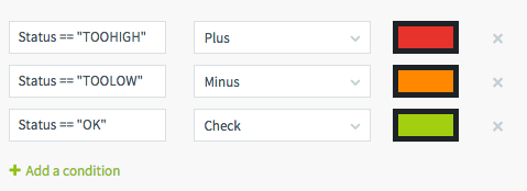
An icon can display various icons based on conditions (see the discussion of Add a conditional color in Properties common to multiple visualization types). The above properties, from the PosApp company details page, display a plus sign, minus sign, or check mark corresponding to the merchant's current status.
For a visual guide to the hundreds of available icons, see: https://fontawesome.com/v4/cheatsheet/
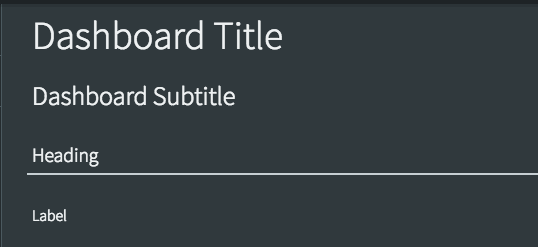
Label
A label is a simple text block. Use labels to add headings or explanations to your dashboards. A label does not have a query, so if you wish to include data from the application in the text, use a Value visualization instead.
Label: the text to be displayed
Text: select desired text color
Background: select desired background color (red slash on black is transparent)
Heading Type: select one of the predefined text label types shown below:
 |
Leaflet map
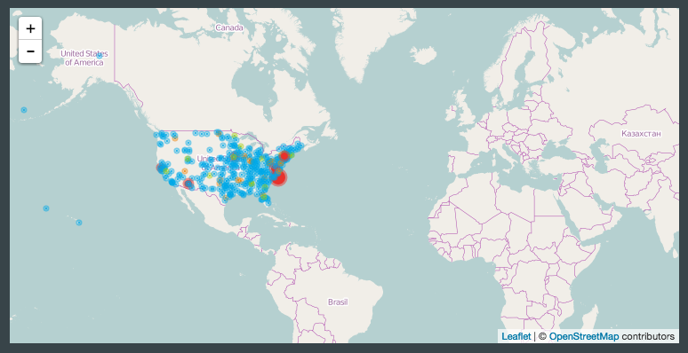
This is similar to the Vector map, but when you zoom in the map includes place names, streets, and street names.
Longitude and Latitude: the fields containing the values to use to plot the map points
Value: the field containing the values that will control the map point colors and sizes
Min Bubble Size and Max Bubble Size: the range of sizes for the map points
View Zoom: set to 1 to show the whole map, or higher to zoom in
View Center Longitude and View Center Latitude: When View Zoom is specified, these settings control where the map is centered.
Tiles URL: The web server from which the map gets its detail data. This should typically be left at its default, http://{s}.tile.osm.org/{z}/{x}/{y}.png.
See Properties common to multiple visualization types for information on the other settings.
Line, scatter, bubble, and area charts
 |
Set the Y (vertical) axis to the values that will control the vertical position of the dots and the X (horizontal) axis to the field that will control the horizontal position.
In line charts, Upper Bound and Lower Bound let you specify the range the chart. Set Lower Bound to 0 for a zero baseline.
A bubble chart is identical to a scatter chart except there is a third axis, Z, that controls the size of the bubbles, so the chart can visualize data from three fields.
See Properties common to multiple visualization types for information on the other settings.
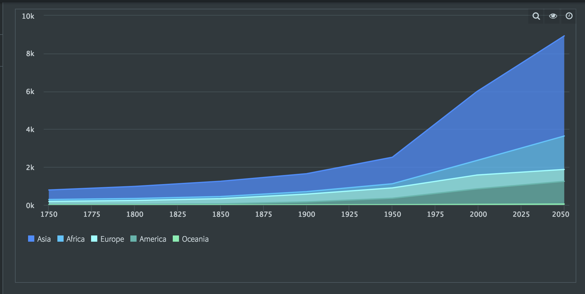
By default, area charts are like line charts, but the area below the line is filled in.
If you change the Stacking option to Stacked, the areas are stacked like this:
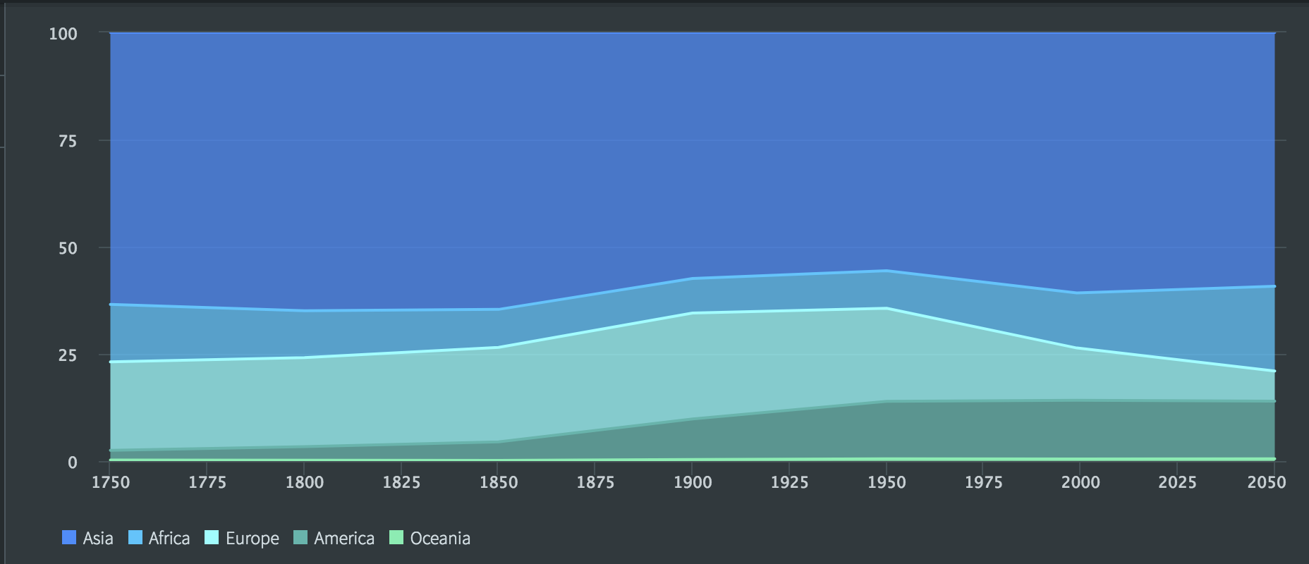
If you change the Stacking option to Percent Stacked, the areas are shown as portions of 100%:
Pie and donut charts
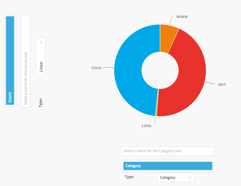
Set the X (horizontal) axis to the field containing the labels for the pie slices and set the axis type to Category.
Set the Y (vertical) axis to the field containing the values that will control the size of the pie sizes. The type may be Linear or Logarithmic.
See Properties common to multiple visualization types for information on the other settings.
Table
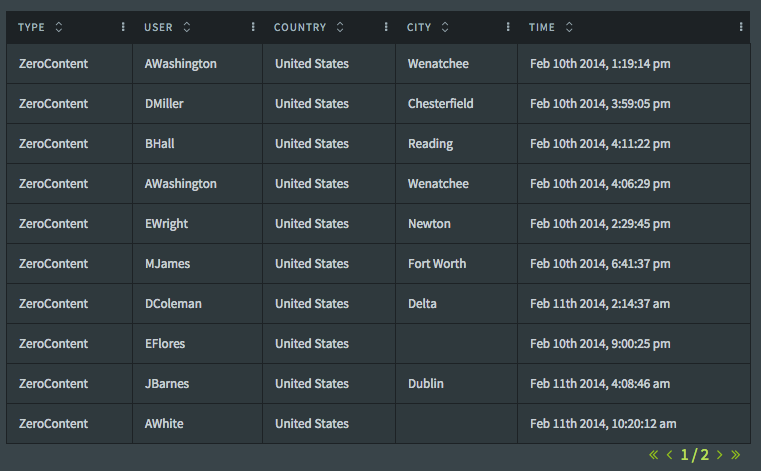
A table displays values in a grid. Optionally, it may contain a search box.
Category: If specified, the table will contain only one row for each value of the specified field. If you want to aggregate values, you must do that in the query.
Show Headers: The first row will contain the column's Label string.
Show Lines: Shows or hides the table grid.
Rows per page: the number of rows to display at a time (note that if you add too many rows to fit in the query frame, the bottom rows will be cut off and not display)
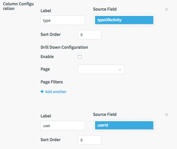
Column configuration: Defines the columns in the table. Click Add another to add sets of properties for each column in the table.
Label: String to display in the header, if it is enabled.
Sort Order: By default, columns appear in the order specified. You may use this property to rearrange them. Columns will appear from left to right in their sort order from low to high.
Source Field: Field to provide the values.
Icons configuration: Adds icons to rows based on the specified expressions. You could use this, for example, to show a thumbs-up icon for expected values and a thumbs-down icon for out-of-bounds values. The expression syntax is the same as for conditional colors.
See Properties common to multiple visualization types for information on the other settings.
Value
A value is a relatively open-ended visualization type that can be used to add almost any valid HTML to a dashboard.
A value visualization does not require a query. Define a query only if you want to use data from the application in conditional expressions or include data in the value (as in the examples below).
When you add a new value visualization, click Add a conditional template.
Expression: If you have only one conditional template, set to true (this setting is case-sensitive, True will not work).
If you have multiple conditional templates, use this field to determine which condition is used based on field values. For example:
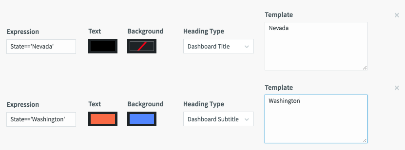
Text: select desired text color
Background: select desired background color (red slash on black is transparent)
Heading Type: select one of the predefined text label types shown below, or leave blank to format using CSS in the Template field:
|
Template: Enter an HTML string to define what the value will display. To include a value from a query alias in the string, put its alias in double brackets. For example, from MultiLogApp:
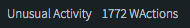
The template for that label is:
<div style="padding: 5px; font-weight: 100">Unusual Activity {{ cnt }} WActions</div>The query is SELECT COUNT(*) AS cnt FROM UnusualActivity; which returns a single value representing the total number of WActions in the UnusualActivity WActionStore as the alias cnt.
Vector map
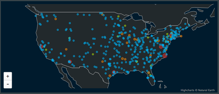
A vector map plots points on a simple world map using the latitude and longitude values in the data. See PosApp for an example of using Zip codes to look up latitude and longitude in a cache.
Longitude and Latitude: the fields containing the values to use to plot the map points
Value: the field containing the value that will control the map point colors
View Zoom: leave blank or set to 1 to show the whole map, or enter a digital fraction (such as .5) to zoom in
X Offset and Y Offset: When View Zoom is less than 1, these settings control where the map is centered. The range for X Offset is 0 (maximum west) to 10000 (maximum east). The range for Y Offset is -10000 (maximum north) to 10000 (maximum south). With X Offset set to 1400 and Y Offset set to -7700, the map will be centered on the United States. With X Offset 5300 and Y Offset -7750, it will be centered on Turkey.
See Properties common to multiple visualization types for information on the other settings.
Word cloud
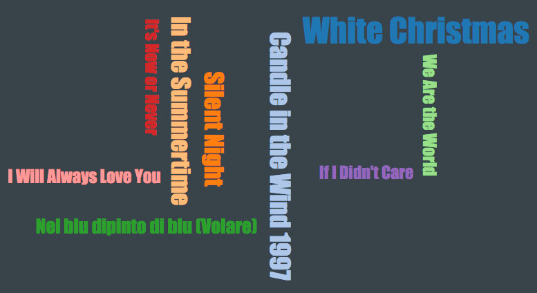
This visualization displays text strings in various sizes proportional to a specified field value. For example, in the data for the above visualization of the top ten all-time best selling singles, the strings are the names of songs, and the values are the number of copies sold.
Word Text: the field containing the strings
Word Size: the field containing the values that will word sizes
Maximum number of values to show: Set this to a value larger than the total number of occurrences of all words to be displayed or the size of the words will be based on an unpredictable subset of the events.
See Properties common to multiple visualization types for information on the other settings.