PosAppDash
To get to the PosAppDash Main page shown above:
From the left menu, select Apps > View All Apps.
If you don't see PosApp, select Apps > Create an App > Import a TQL file, navigate to
Striim/Samples/PosApp, double-click PosApp.tql, enterSamplesas the namespace, and click Import.At the top middle of the browser window, select Created > Deploy App, then click Deploy.
When deployment completes, select Deployed > Start App. The counter on the bell (alert) icon at the top right should start counting up, indicating that alerts are being generated.
From the left menu, select Dashboards > View All Dashboards, then click PosAppDash.
The following discussion gives a brief overview of the underlying queries and settings for some of the visualizations in this dashboard. For more details, see Dashboard Guide. To explore the settings yourself, click the Edit button at the top right.
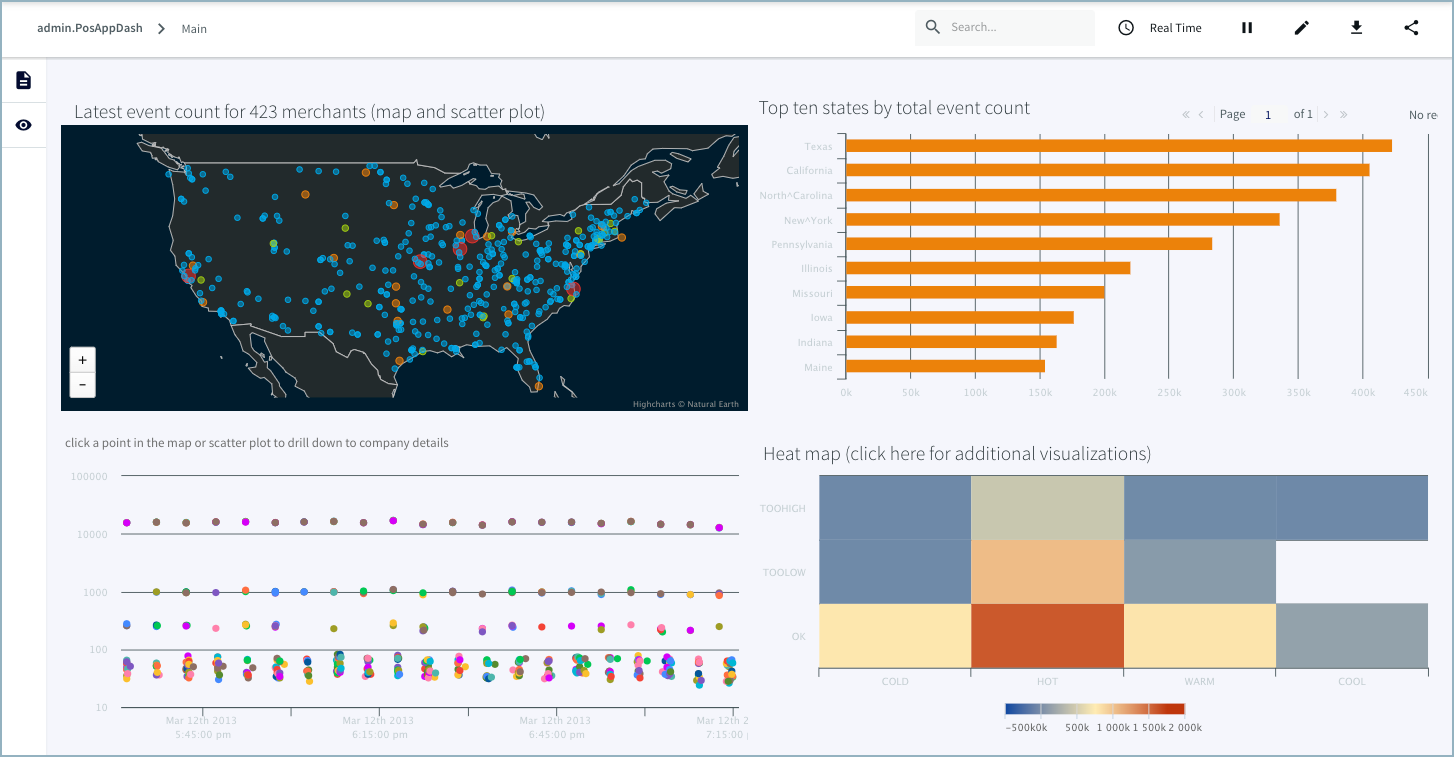
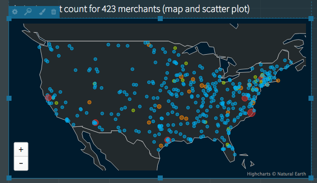
Main page vector map
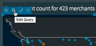
To view a query for a visualization, click Edit Query. When done, click x to exit.
The basic query for this map is SELECT * FROM MerchantActivity ORDER BY StartTime, which gets all fields from the MerchantActivity WActionStore. The ORDER BY clause ensures that the map looks the same every time you run the application.
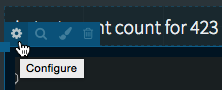
To view the properties for a visualization, click Configure. When done, click x to exit.
The fields are assigned to map properties as follows:
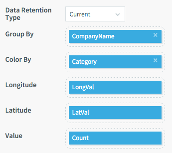
Data Retention Type = Current means the map shows the latest events for each map point. Group By CompanyName means each company gets a single dot on the map. Color By Category means the colors are based on the Category field value (more about that below). The Longitude and Latitude properties are set to the fields with the coordinate values. Value = Count means that the size of the dot on the map varies according to the number of transactions in the company's latest event.
The colors of the map points are set manually:
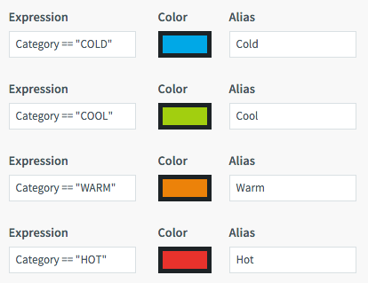
If the map had a legend, it would use the alias strings:
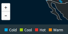
See Vector map for more information about these settings.

The map's title is a "value" visualization, which can add text, query results, and almost any valid HTML to a dashboard. Its basic query is select count(distinct(MerchantId)) as mcount from MerchantActivity, which returns the number of merchants displayed on the map (currently 423). The underlying code is:
<div style="padding: 5px; font-weight: 100; font-size: 1.5em">Latest event count for
{{ mcount }} merchants (map and scatter plot)</div>
See Value (text label) for more information.
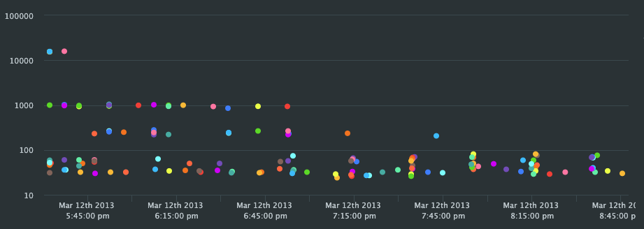
Main page scatter plot
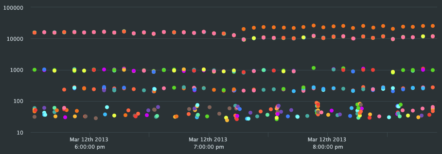
The scatter plot uses the same basic query and Group By Company setting as the map plus SAMPLE BY Count MAXLIMIT 500. The Data Retention Type is All, so it shows a range of Count values over time for each company. If you changed Data Retention Type to Current, it would show only the most recent Count value for each company (the same data as on the map):
Main page bar chart
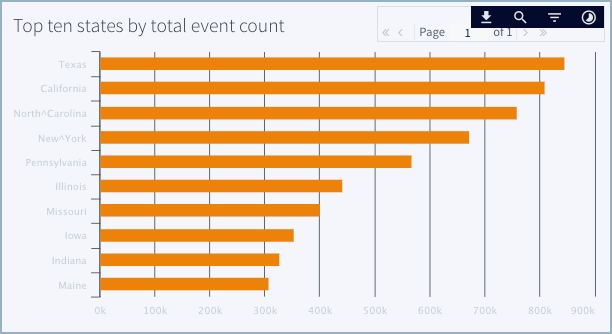
Hover on the upper right of the chart to access a menu where you can:
download its .csv data
search for text
filter by attributes or time
The basic query for this bar chart is select sum(Count) as Count, State from MerchantActivity group by State order by sum(Count) desc limit 10, which returns the top ten total counts (for all merchants) by state. For more information, see Bar chart.
Main page heat map
Click the link to view additional representations of the data, such as pie charts and maps.
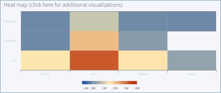
The heat map for PosAppDash represents the total counts for 12 combinations of Status and Category, with blue representing the lowest counts and red the highest. See Heat map for a discussion of the query and settings.
Company details page line chart
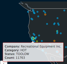
If you are in edit mode, click Done to stop editing. Then, in the map, click on the big red dot for Recreational Equipment in California to drill down to the "Company details" page.
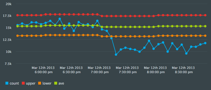 |
The green line represents the average count, red and orange represent the upper and lower bounds, and blue is the count itself. You can see that between 7:00 and 7:30 the count dropped below the lower bound, which means its current status is TOOLOW.
The basic query is select CompanyName, Count, UpperLimit, LowerLimit, HourlyAve, StartTime, City, State, Zip, MerchantId, Status, Category from MerchantActivity. The queries also include where MerchantID=:mid, which limits the results to the company you drilled down on (see Creating links between pages). Data Retention Type is All because we’re plotting the values over time. Group By is blank because we are not grouping the data. Color By is blank because colors are set manually as for the map.
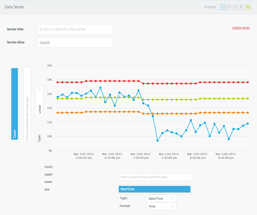 |
The horizontal axis for all series is is StartTime. The vertical axis uses a different field for each of the four series (Count, UpperLimit, HourlyAve, and LowerLimit). Above, series 1 (Count, the blue line) is selected. The Series Alias defines the label for the legend. To change settings for another series, click its number in the selector at upper right.
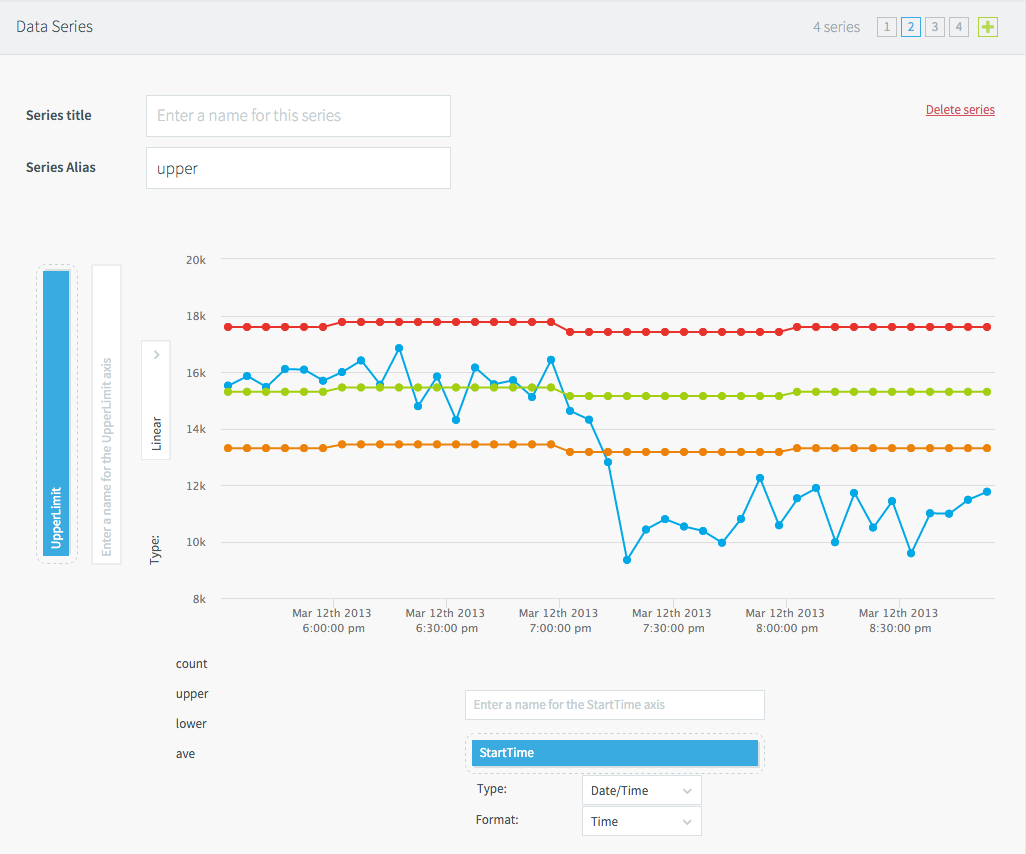 |
Here we see the settings for series 2 (UpperLimit, the red line).
For information on the other visualizations on this page, see Gauge, Icon, and Table.
Interactive HeatMap page donut charts
To return to the main page, click PosAppDash.
Then click click here for additional visualizations in the heat map title.
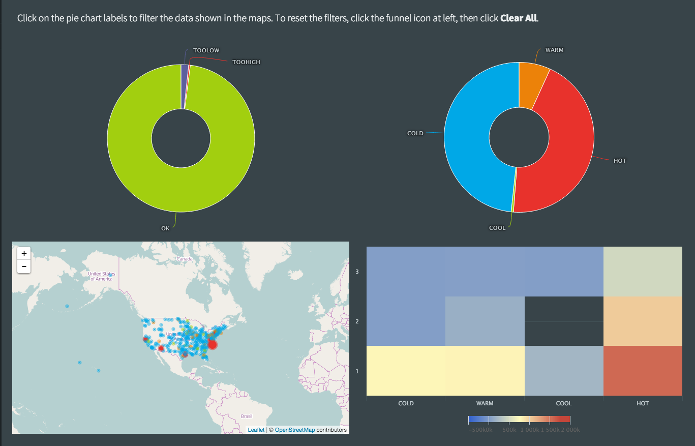 |
The basic query for both donut charts is SELECT count(*) AS Count, Status, Category FROM MerchantActivity.
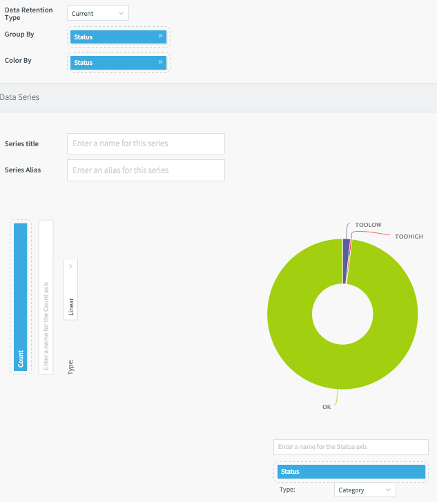
The left chart (settings shown above) shows the total Count for each Status (OK, TOOLOW, TOOHIGH). The right chart shows the total Count for each Category (COLD, COOL, WARM, HOT).
See Making visualizations interactive for discussion of how clicking segments in the donut charts filters the data for the page's vector map and heat map.